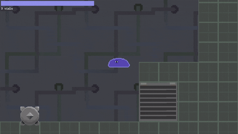
Reconstitute is a physics-driven 2D platformer centred on a malleable blob character whose movement relies on squash, stretch, and momentum. The project aimed to explore the expressive yet simple style of 2010s Flash games, with a focus on clear, expressive animation and emphasised movement. The visual style is simplistic – pixel art with a restricted colour palette – and animations were kept to short loops. I implemented visual cues for mechanics, such as an obstacle hanging over a ledge, tempting the player to push it over.
Problem-Solving – Bugs and solutions
During development, some issues surfaced around collision consistency and movement states. One such bug was the collectable item’s collision causing the player to lose momentum. This was fixed by turning the shape of the item’s collision box into a ramp – this allowed the player to “glide” up the item without a hard stop. This improved movement clarity and stopped the player’s momentum from being abruptly interrupted. Another bug involved wall collision; an oversight in my custom collision system – detached from the environment’s graphics – led to all walls being treated as floors, meaning the player could jump while sliding down a wall. I realised that a wall-jumping mechanic would fit in with the existing movement and allow for more interesting puzzle designs, so I tuned this behaviour into a formal mechanic.
The final prototype was an exercise in responsiveness, telegraphed feedback, and playful physics. It served as an opportunity to refine my understanding of moment-to-moment feel in platform mechanics and the technical considerations behind physics-focused platformers.
H.E.R.O
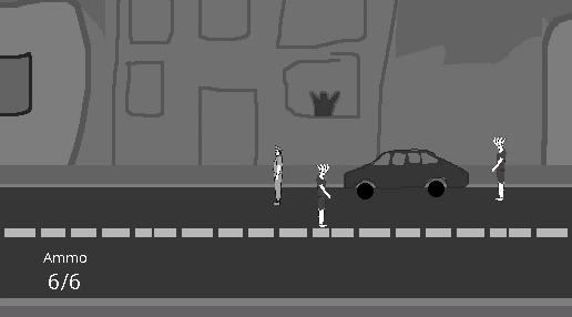
Side-scrolling shoot 'em up prototype
This collaborative project studied combat pacing, enemy readability, and structured difficulty curves. Initial mechanical design defined the player’s toolset, enemy behaviours, and encounter rhythm, informing the implementation of projectile handling, collision responses, and layered enemy patterns.
Inspirations – Tone and style
The overall theme for the game was gritty, but tongue-in-cheek – reminiscent of 80’s cop shows and arcade games. We aimed to parody extreme portrayals of cops in media rather than comment on law enforcement itself. The protagonist was to be a “last cop standing” – a la Bruce Willis in Die Hard – fighting to reclaim his city, restore his squad’s morale, save screaming citizens, and take down the edgiest of criminals. We opted for a low frame rate, and papercraft art style to reinforce that the parody confronts cop and criminal related media.
The prototype makes use of rough development art build to demonstrate the early visual direction while allowing for quick mechanic implementation and major bug fixing. Through iteration, I identified issues with enemy attack telegraphing being weak, which led to unexpected difficulty spikes. I resolved this by refining timings and behaviour cues to ensure encounters felt challenging but fair. Boss difficulty was adjusted by making the spawn conditions stricter and reducing attack aggression. Civilians running to safety after being saved by the player was scrapped to reduce visual complexity. To ease difficulty spikes further, buddy cops who received morale from the player were granted a random chance of giving the player a taser for stunning enemies.
Scope creep was a problem for this project, and some planned features had to be reduced or removed entirely. This project strengthened my understanding of designing enemy encounters and using early visual prototypes to evaluate readability. I also learned the importance of deciding on a core set of mechanics before implementation, to prevent scope creep.
Virtual pet game
Desktop pet simulator
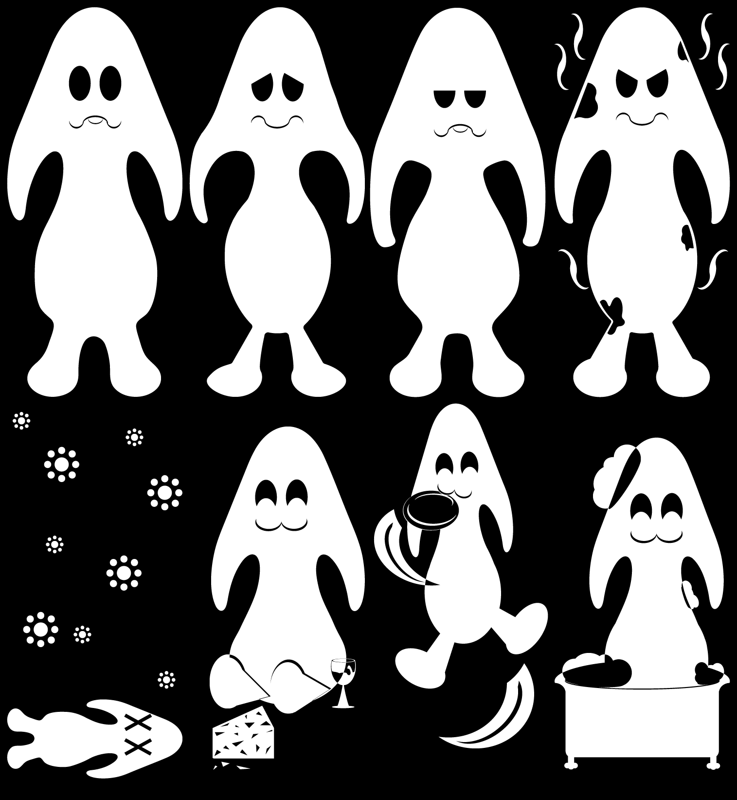
Inspired by pet simulators such as Tamagotchi, this virtual pet prototype focused on clear, easily understood interactions, underpinned by timed decay systems that shape the pet’s mood and behaviour. The design emphasises readability: each action has clear feedback, and the pet’s state transitions are intentionally easy to interpret.
Visual design – Cues and legibility
Restricting the visual design to monochrome let me focus on semiotics: each symbol and expression needed to be immediately legible, even at a small scale. For button and symbol design, I drafted multiple options and gathered feedback on recognisability. I also explored shape theory, balancing stylistic choice with readability. For pet design, I was inspired by mascot characters that mix familiar animal cues with a slightly surreal twist – similar to how Namco’s Klonoa feels cat-like without being tied to a real species I eventually settled on a mushroom-type pet, styled with a slightly eccentric personality, a fondness for cheese and wine, and a lifecycle that ends with a playful spore-burst to loop back to the start of the next pet’s life.
Feedback and bugfixes
Early builds exposed conflicting timers and out-of-order triggers that caused unpredictable mood shifts. I rebuilt the timing logic to restore consistent pacing, then improved visual and audio feedback to reinforce state changes. Further beta tests found that the need decay was too fast, which I fixed. A persistent feedback point was that all needs decayed equally, meaning that players found themselves chasing actions quickly, which diminished the real-life feeling of the pet. In the future, I would adapt the decay to be more responsive, such as a “play” action causing the food and cleanliness needs to decay faster.
The project provided valuable experience in working with simple mechanics and reinforcing intuitive feedback for non-verbal game states. In future iterations, I would like to expand the animation set and introduce additional options for feeding, cleaning, and play to broaden the pet’s expressive range and provide more variety to the player.
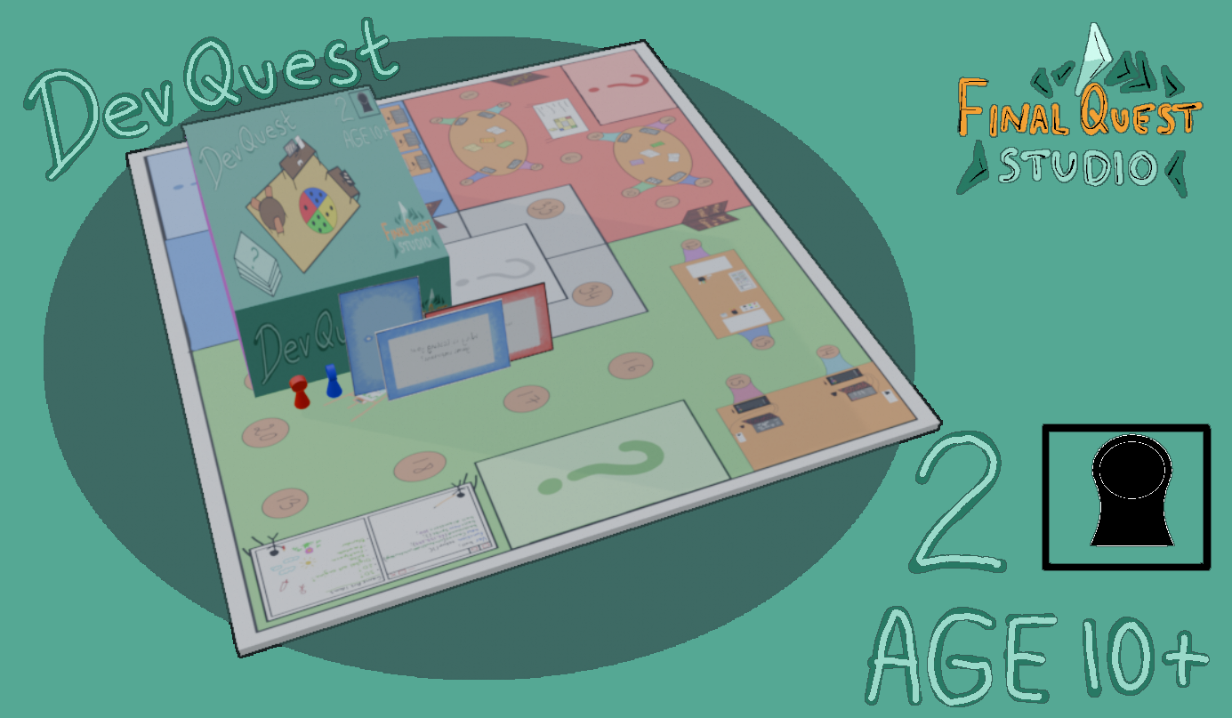
DevQuest
Collaborative board game project
DevQuest is a tabletop board game that simulates a stylised game development cycle through resource management and event-driven challenges. The board layout mirrors production phases – pre-production, development/design, and post-production – for both stylistic and mechanical purposes. Players manage two primary resources: “Bugs,” accumulated through failed tasks, and “Fans,” gained through successful ones. Both may increase and decrease through random events. Players must manage “Bugs” without losing “Fans” while racing to their game’s launch day at the annual game awards.
Key focuses – Design language and replayability
Each board section features unique trivia cards related to that phase of game development — for example, questions about game engines in development or event-management prompts referencing real-world industry events. We designed questions to be approachable for all players, with some relying on logic or basic math rather than industry knowledge.
Broad-spectrum accessibility was a major design focus. Iconography, visual simplicity, and instruction clarity were designed to support younger players, older players, disabled players, and those unfamiliar with resource-management board games or the game industry in general. The game is for those age 10 and up and can be played in teams or as individual players. We integrated narrative elements into mechanics so that events reinforce the theme rather than functioning as detached flavour text.
The project strengthened my skills in tabletop design, accessibility considerations, and integrating narrative elements with mechanical systems.